Add a Responsive Stacking Table (for Content)

A stacking table is primarily used for defined sections of content which span horizontally. In the admin view, light gray borders display around the cells. On the public view, these disappear. When viewed responsively, each row's cells will stack vertically on top of one another. If you plan on using a table for data, please view the article for condensed tables.
 Desktop Admin View
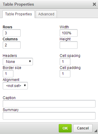
Basic Settings
- Select the 'Table' icon from the toolbar.
- Enter the appropriate number of Rows and Columns.
- Adjust necessary properties:
- Headers will apply a bold formatting to the text in your first Row, Column or Both.
- Border Size refers to the width of the border of the table; the default setting is "1". Change to "0".
- Alignment refers to the positioning of the table within the page.
- Width of the table should be entered as a percentage (%). For instance, a table that will take up the entire width of a page will be entered in as "100%".
 Make sure to place in the "%" symbol.
- Height will not be applicable.
- Cell Spacing refers to the the spacing between cells. (Can only be entered in whole numbers.)
- Cell Padding refers to the padding between the content of your cell and the cell wall. (Can only be entered in whole numbers.)
- Caption will not be applicable.
- Summary will not appear on your page, but displays in the HTML code for the purpose of speech synthesizers and braille reading machines that aid visually impaired users. This should be a general description of the content of your table.
Responsive Settings
Table Properties
- Choose the Advanced tab.
- In the Stylesheet Classes box, enter "table-responsive".
- Select OK.

Images (if applicable)
- Backspace the number in the Width field. The Height will delete automatically.

When the images display in a responsive view, they will expand up to their original size to fill in the width of the screen. If the images have a fixed width and height (pixels), they will be limited as to how large they can get. By eliminating the dimensions, you are enabling the image to take up 100% of it's allotted space.

If you remove the dimensions from a high quality (large sized) image, it will appear very large in your editor. When it is viewed on the website however (public view), it will appear at a smaller size as it will be constrained to the width of it's cell. Be sure to use the Server Preview button to test its display.


Responsive View
In responsive view, if you notice colons (:) appearing next to each column, please notify us so that we may resolve the issue for you.